MARY BRIDGE CHILDREN'S HOSPITAL
ride with courage
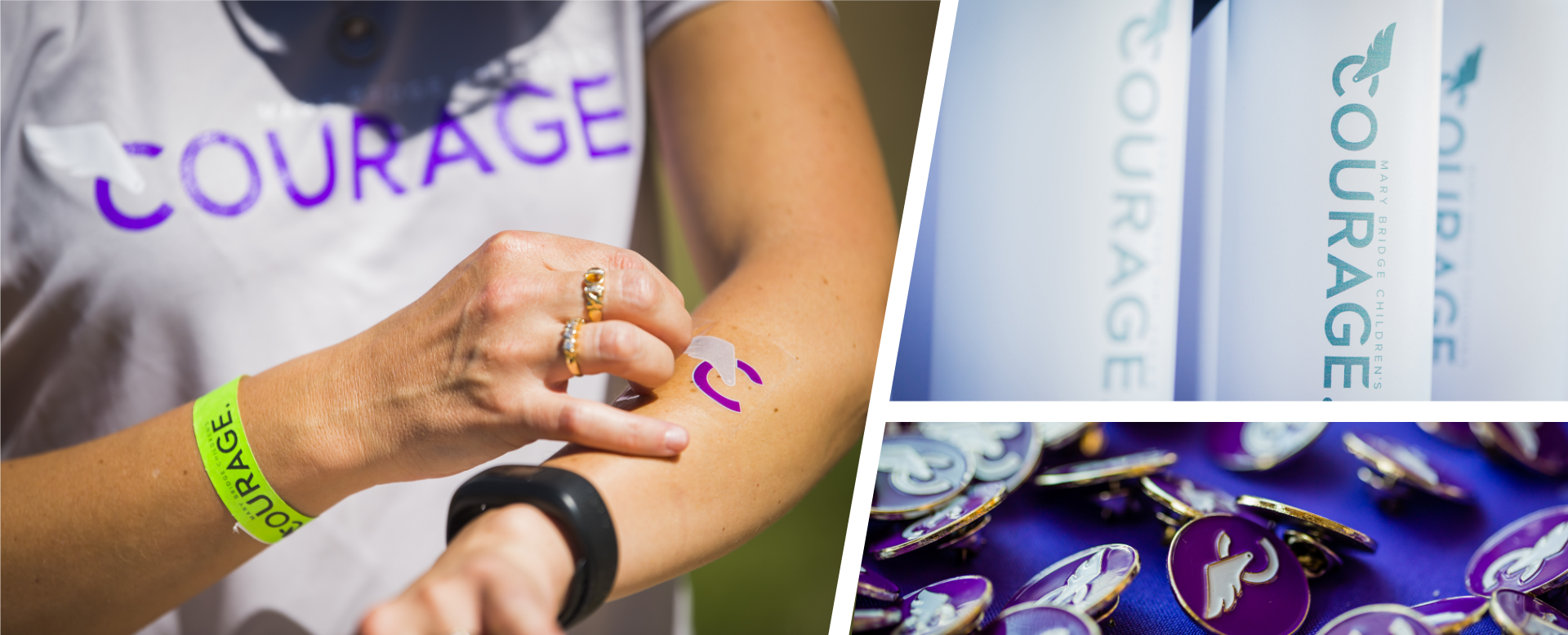
After 25 years, Mary Bridge's charity ride was ready for its next evolution. As avid cyclists, we were honored to rebrand the event, and rode with Courage alongside our clients for the relaunch.
HOW WE HELPED
Strategy + Branding, Iconography, Print Advertising, Promo Items + Apparel, Social Media Assets, Signage
Photos by Ingrid Barrentine + Nathan Golden

hover to view previous logo
A FRESH NEW LOOK
In developing a new logo for the event, our goals were simple: streamlined, modern and iconic. Bold and impactful like the cause itself, the logo's geometric letterforms received aerodynamic styling while retaining optimal legibility. Courage's updated look and feel set the tone for a new chapter in the ride's well-known legacy.

JERSEY PATTERNS
Patterns were developed to mimic the topography of the ride's routes, which traverse the foothills of Mt. Rainier. Mountain landscapes were illustrated using an adaptation of the Courage wing, finding their way onto jerseys, bandanas, signage and more.
FINDING THE WAY
Iconography delineated the five different route options: Rainier Family, Cascade Cruiser, Tahoma Half Century, Northwest Brew Thru and The Sasquatch. This marked the first year Courage offered a variety of ride lengths, making the ride more accessible for various skill levels and age groups.


